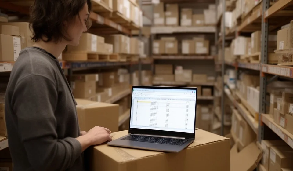
KPI dashboard template in Excel

KPI dashboard template in Excel
Closing the month should not be an act of faith. In many small businesses the sales stay in the invoices, the costs in the supplier's notebook, the receivables in a pad and the stock in the owner's head; in the end every figure lives somewhere different and nobody can say at a glance whether the month was better or worse than the last. The closing meeting then fills up with opinions and runs out of data.
This KPI dashboard template in Excel settles that on a single sheet: you type the figures for the month, the template works out seven indicators, builds the series for the last twelve months and draws a line chart with sales and profit. Everything is read on one screen, with no formulas in sight and no hidden tabs.
⬇ Download the template (Excel .xlsx)What the dashboard is and who it is for
A dashboard is a sheet that turns the month's data into a few numbers that can be compared. It is not a long report or a financial statement: it is the screen the owner looks at on the first day of the month to find out how things went, and the starting point for the meeting with the accountant.
It serves the shop owner who wants to know whether the business grew; the workshop manager who needs to see whether profit is eating the cash; the accountant who has to explain in five minutes why a month with more sales left less profit; the partner who only comes into the office once a month and needs the whole picture. It also serves the business that already keeps templates for sales, costs and receivables and wants those scattered figures to tell a single story.
The dashboard does not replace the books or the accounting; it sums them up. Its job is to answer four questions that come back every month: how much was sold, how much was left, how much the stock moved and how much money is still waiting to be collected. When those four answers sit on the same sheet and in the same format every month, decisions stop resting on memory.
What the template includes
The file is a single-tab .xlsx spreadsheet organised in blocks that read from top to bottom: first the data you type, then the indicators that calculate themselves, then the twelve-month series and, at the bottom, the chart. This is what it contains:
| Item | What it brings |
|---|---|
| Data block | seven input figures for the month: sales, sales of the previous month, cost of sales, expenses, new and lost customers, stock on hand at value and receivables |
| Indicator block | seven automatic results: growth, profit, margin, net customers, stock turnover, days of stock and days of receivables |
| Twelve-month series | one row per month with sales and profit, so you see the trend and not just the single month |
| Line chart | the two series drawn in grey over the same time axis, with no colours or decoration |
| Header | company name and currency, with room for the cut-off date |
| Instructions | what it is, how to fill in the data block, how to read the indicators and the most common mistakes |
The blocks and fields of the sheet
The sheet does not carry hundreds of columns: it carries just the fields needed so nobody gets lost among formulas. The figures typed by hand sit at the top; underneath are the indicators the template works out on its own from those figures. The automatic fields are not touched.
| Field | What you type or what it returns |
|---|---|
| Sales of the month | input: what was invoiced in the month being closed |
| Sales of the previous month | input: what was invoiced in the month immediately before |
| Cost of sales | input: what the goods that were sold had cost |
| Expenses | input: payroll, rent, utilities and the other costs of the period |
| New and lost customers | input: how many came in and how many stopped buying |
| Stock on hand at value | input: what the goods left in the warehouse are worth |
| Receivables | input: how much is still waiting to be collected at the close of the month |
| Growth | automatic: compares this month's sales with the previous month's |
| Profit | automatic: sales minus cost of sales minus expenses |
| Margin | automatic: how much of the sales the profit represents |
| Net customers | automatic: new customers minus lost customers |
| Stock turnover | automatic: how many times a year the stock is turned over |
| Days of stock | automatic: how many days that stock would take to sell |
| Days of receivables | automatic: how many days the collected money takes to come back |
| Twelve-month series | sales and profit month by month, for the trend |
| Line chart | sales and profit drawn over the same time axis |
How the indicators are calculated, with a worked example
Growth compares this month's sales with the previous month's: the difference divided by the sales of the previous month. Profit is what is left of the sales after subtracting the cost of sales and the expenses. The margin places that profit inside the sales, to show how much of every unit sold stayed in the business. Net customers are the new ones minus the lost ones, and the sign tells you whether the base is growing or shrinking.
The last three indicators look backwards and forwards at the same time. Stock turnover takes the cost of sales and projects it over twelve months to express how many times a year the goods go round; days of stock turn that turnover into days, and days of receivables do the same with collection. Those three figures show how much money is asleep in the warehouse and how much is asleep out on the street.
Take the example built into the template: if sales for the month are 6,000,000 and the previous month came to 5,400,000, growth is eleven per cent. With a cost of sales of 3,400,000 and expenses of 2,200,000, profit comes to 400,000 and the margin is close to seven out of a hundred. Stock on hand at 2,400,000 gives a turnover of 17 and more than twenty days of stock; receivables of 1,200,000 work out at six days of receivables.
| Figure or indicator | Value |
|---|---|
| Sales of the month | 6,000,000 |
| Sales of the previous month | 5,400,000 |
| Growth | eleven per cent |
| Cost of sales | 3,400,000 |
| Expenses | 2,200,000 |
| Profit | 400,000 |
| Margin | close to seven out of a hundred |
| Stock on hand at value | 2,400,000 |
| Stock turnover | 17 |
| Days of stock | more than twenty |
| Receivables | 1,200,000 |
| Days of receivables | 6 |
Step by step
- Download the file and open it in Excel or in a compatible spreadsheet program.
- Type the company name and the working currency in the header.
- Fill in the data block with the figures for the month: sales, sales of the previous month, cost of sales, expenses, new and lost customers, stock on hand and receivables.
- Read the indicator block: growth, profit, margin, net customers, stock turnover and days of stock and of receivables.
- Add this month's row to the twelve-month series and watch how the two lines on the chart moved.
- Save a copy named after the month before clearing the data for the next period; that way you keep the series without losing the history.
Tips and common mistakes
- Always use the same month cut-off. If one month closes on the 30th and the next on the 5th, growth loses its meaning and the dashboard compares different periods.
- Do not mix sales with tax and without tax. Choose one criterion and keep it the same in both sales columns, or growth will come out distorted.
- The margin is not the profit. A bigger profit with a smaller margin may mean the business grew but became more fragile.
- Read days of stock and days of receivables together. Goods standing still and receivables going stale are the same money asleep in two different places.
- Write down where each figure comes from. Without knowing whether the cost comes from the stock records or from an old invoice, a correct indicator is no help in deciding.
- Do not delete the previous month's data. The comparison is half the dashboard; without the previous month, growth stays blank and there is nothing to read it against.
When to move to inventory and sales software
The dashboard works as long as somebody feeds the figures in by hand. The problem is not the formula but the figure: if the sale ought to come from the sales register, the cost from the stock records and the receivables from the accounts receivable, typing it all in again every month is duplicated work and a source of errors. That is where Kardex Tauro helps: receipts, issues and the cost of every item stay in one place, so the dashboard figures are already worked out instead of being chased between folders.
The natural step is not to replace the spreadsheet overnight, but to stop retyping. While the catalogue is short and one person handles the figures, the template is enough and it is cheap. Once several warehouses, several salespeople or hundreds of references appear, the sale and the cost change every day and the dashboard is out of date almost as soon as it is finished. That is the moment to look at software: when the indicator is easy to calculate but getting the right figure has become the job.
Download the dashboard, type this month's figures and compare them with last month's. The first time you see the whole trend, the conversation for the month changes tone.
⬇ Download the template (Excel .xlsx)